About
Have you ever done graphic design before? This is the page where I do all of my graphic designs by using Adobe Photoshop.
1. How much experience have you had using Photoshop before this course?
I learned how to use Photoshop back at my secondary school, and I think I've had a great experience using Photoshop.
2. List as many examples as you can think of where Photoshop is used in the creative media industries.
a) Film Posters
b) CD/DVD covers
c) Making a fan image
d) Customised images
e) Book covers
3. What is the average salary of a graphic designer in the UK?
The average salary designer in the UK is £40,000.
Photoshop Designs
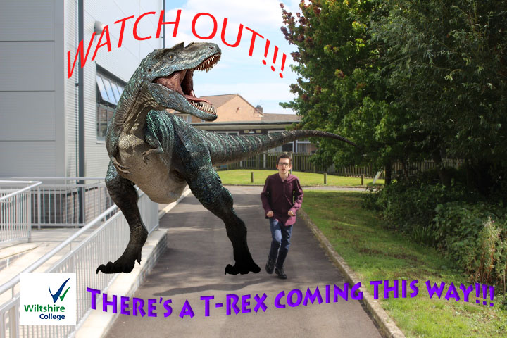
T-Rex pictureIt looks like he's been chased by a dinosaur running around Wiltshire College during break time.
|
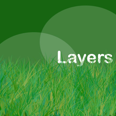
Layers TutorialIn Adobe Photoshop, we learned how to design a replica of layers like on the one that Fraser demonstrated for us (we don't have the one that he created).
It was too hard to make at start, but I had a bit of help from Fionn. I couldn't remember most of the tools from Photoshop when I was at St. Laurence School. I might have to remember how to use the tools in Photoshop again. |
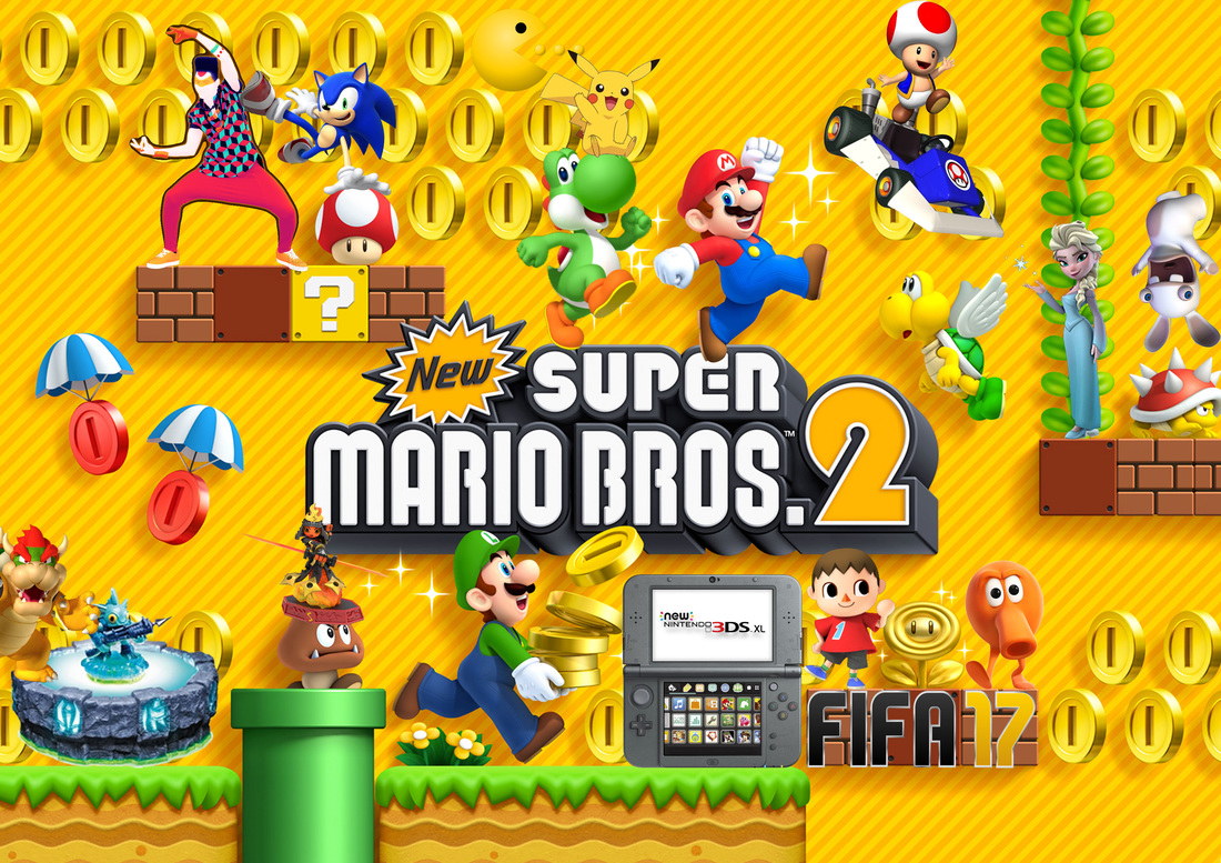
Skill ThreeIn Adobe Photoshop, we designed our own gaming collage that has to include our favourite video game characters to be seen on different random parts of your background.
|
Deep Space 12 mood board
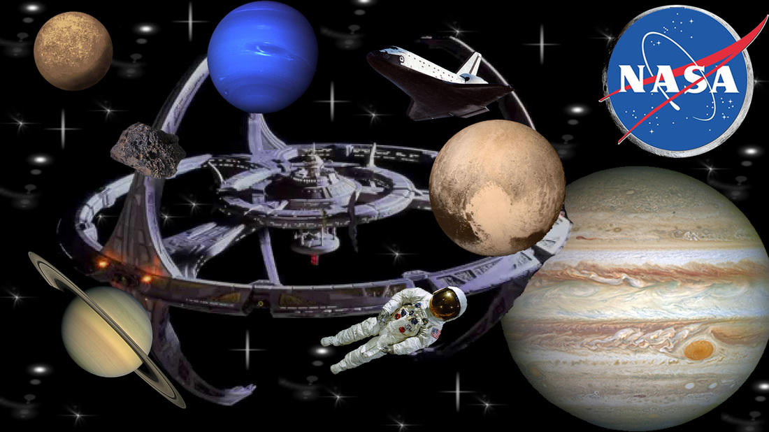
Deep Space 12 Mood Board - I added lots of photos from Google that has to link with space, which is part of the mood board. I added a sticker of stars shining in space, I added a list of pictures of the planets from the solar system, not all of them, and I added a picture of a spaceship in galactic space.
Trash mood board
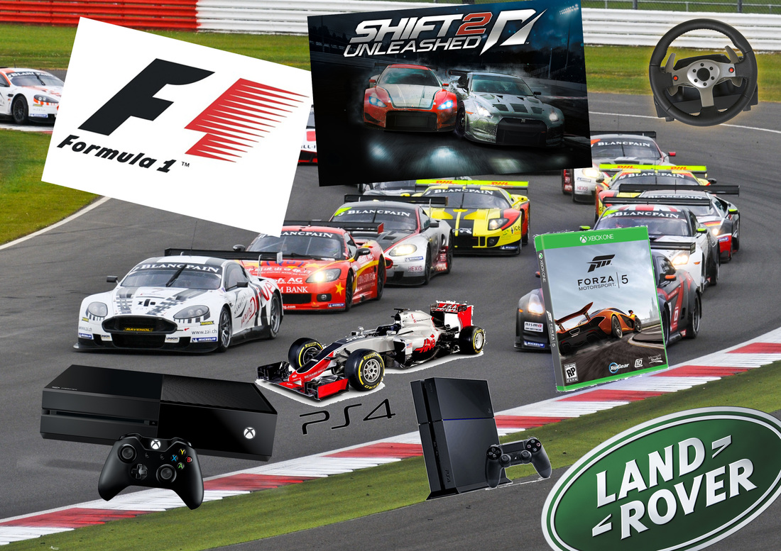
Trash Mood Board - I made the mood board, because it's all to do with car arcing in video gaming (eg. Xbox One, PlayStation 4). I added a background with cars racing each other, I added a few pictures of cars who also joined the race, I added different cars logos, only a few of them, and I added the picture of the Xbox One and the PlayStation 4.
Gaming Logos
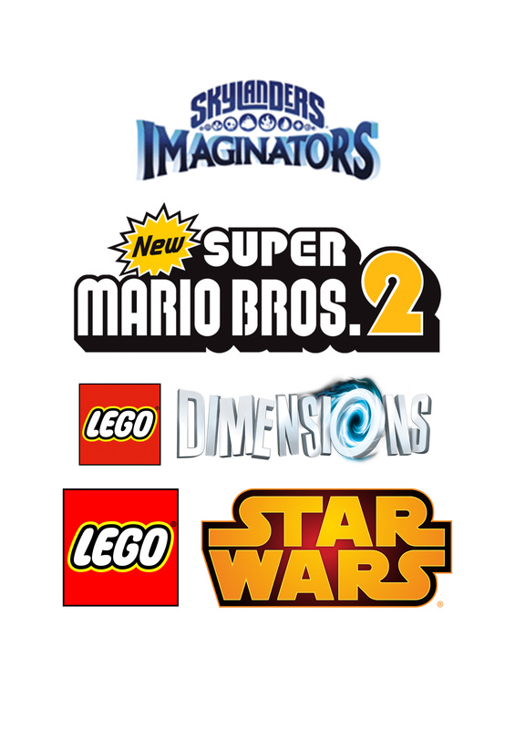
The first logo is a little dark, and the game title means you have to imagine what your own skylander will look like in the next instalment of the Skylanders franchise. I think the colours link with the game, because it helps the game create a better army of skylanders. I think this game is suitable for children. It looks like a text type and it's 3D alike.
The second logo is bright, and the game title impresses me with the name of the character, I can tell that it's NEW, it's for kids, because the game has bright colours and 3D together with 2D animation techniques. With those, it's a sequel because of the number 2. I like the logo, because it's for kids of all ages.
The third logo is bright and interesting, because it tells us that we want to travel to different dimensions in LEGO bricks. The LEGO logo on the left is always there, because it's a LEGO game. Adults walk into a shop, they want to buy a game, they're not sure what to buy, and their kids know they like LEGO, so they just buy LEGO Dimensions without even asking themselves. The same thing goes for the last logo.
The last logo is bright and dark, because it tells us that we want to travel to the galaxy far, far away with LEGO bricks. The LEGO logo is still there, because it's a LEGO game. Adults walk into a shop, they want to buy a Star Wars game, they're not sure if they want to buy Battlefront, but they think it's not for kids, so their kids know they still like LEGO, so they just buy LEGO Star Wars without saying the game IS or NOT inappropriate.
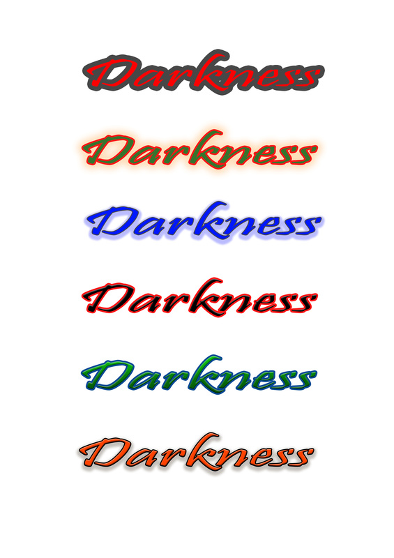
Typographic logos
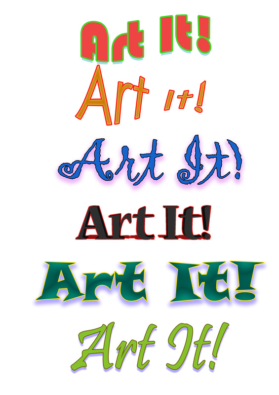
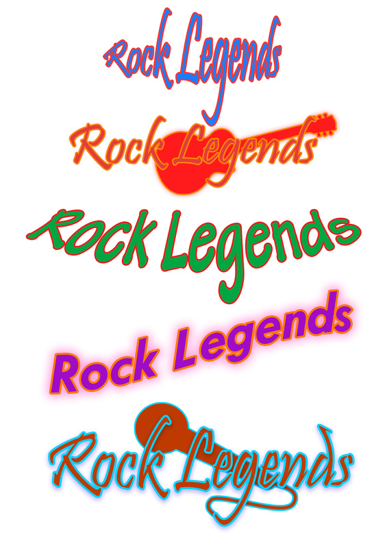
In our third session, we designed our own typographic logos that link with titles of different video games and genre types.
Our task was to produce a range of typographic logos for 2 of 3 titles Frazer gave to us. The number of titles we used with the chosen titles were 6 logo variations per title.
Our task was to produce a range of typographic logos for 2 of 3 titles Frazer gave to us. The number of titles we used with the chosen titles were 6 logo variations per title.
Art It! - For Nintendo 3DS & 2DS
Rock Legends - For PlayStation 4 + Xbox One
Darkness - My own title
Video Game Poster (Project brief)
In our fourth session, we started doing a mood board of what our video game/movie poster is going to look like. We gathered some images from Google that match/link to our titles. To help us, we also wrote down a mind-map that gave us some ideas about what I wanted in my poster.
Mind-map full of ideas
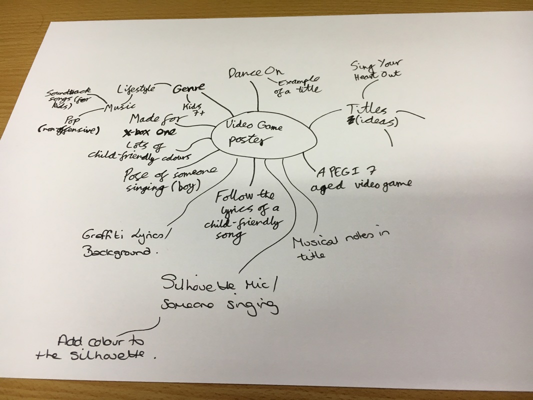
Shot from my iPhone
Mood board
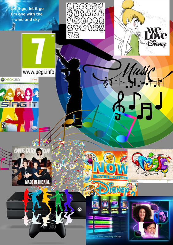
In my mood board, I gathered some images from Google that linked with my poster title + ideas (eg. Sing My Heart Out). It shows the theme of the game, which in this case is child-friendly sing-along music. For example, children can sing along to their favourite Disney songs or maybe a bit of One Direction.
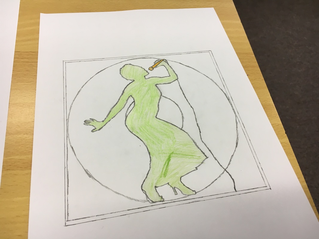
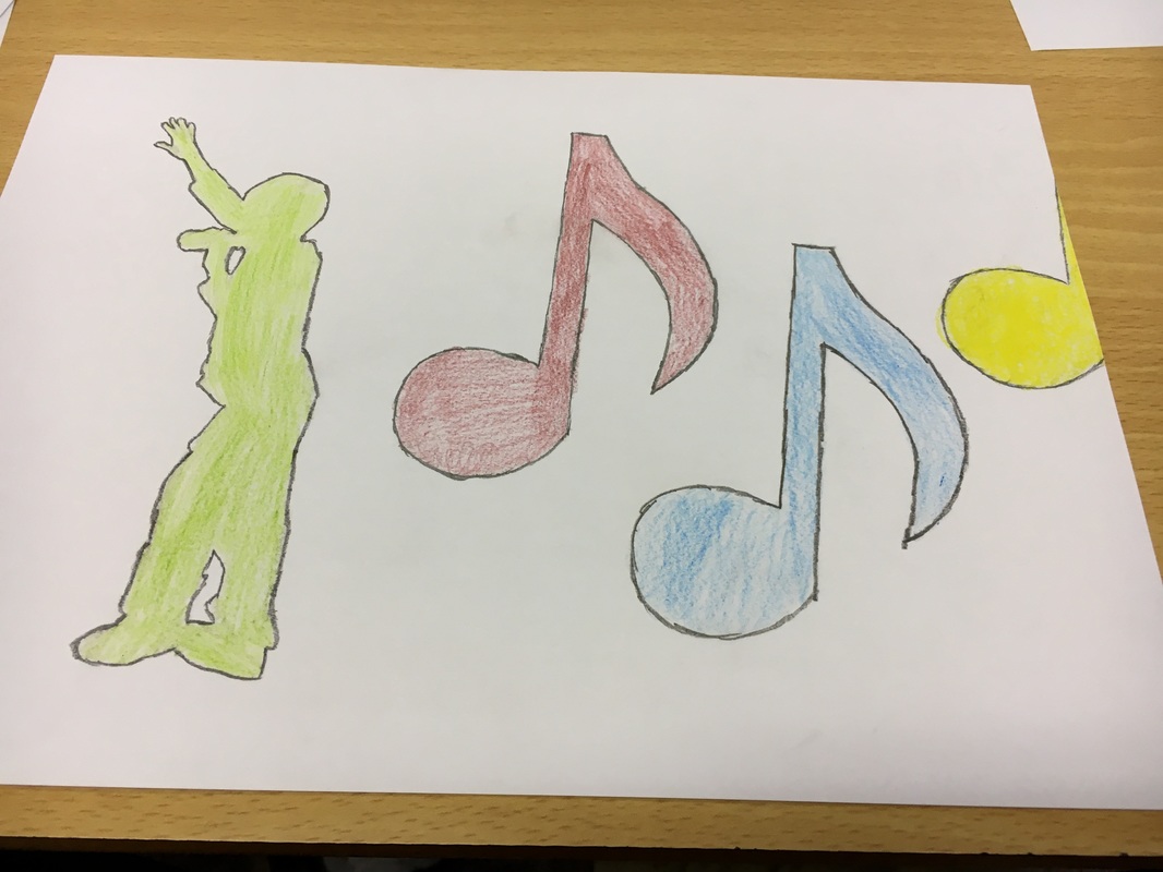
Sketched ideas
We drew our own sketches that link to our topics, but my topic was on a singing video game. I think the first sketch is the best, because it helps me fit in with singing and dancing on the cover of a record album.
|

|
|
Shot from my iPhone
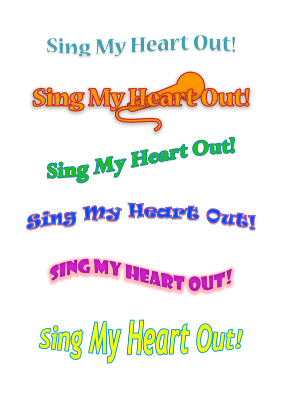
Typographic Logos (examples) for Video Game poster
I selected the second logo on my sheet, because it suits me and the microphone helps the title stand out.
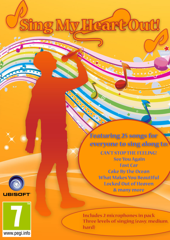
Video Game Poster Final design
|
I could've improved on my poster. I could have thought of something else to go with it, but my head was out of ideas. But, I think I did well designing this poster and the idea to go with it. I should keep the colour scheme the same colour with the ones on my poster alongside the logo and the shapes for the writing (25 songs included...). I think the silhouette and the title work out the best.
|
|
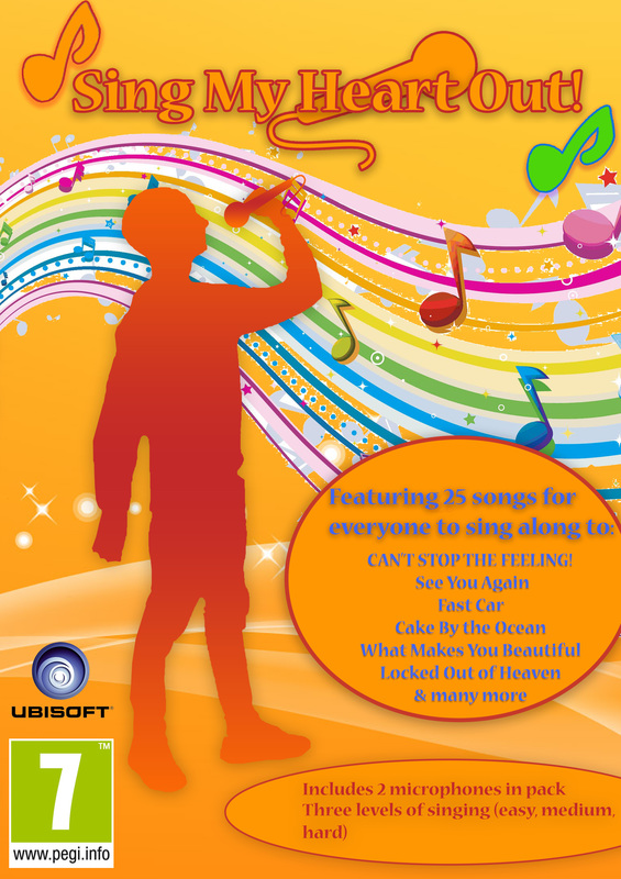
I did changes to the previous design of my poster, because the colour green stood out too much. I also changed the colour of the writing, because I wanted it to fit in with the colour scheme.
If I wanted to do the project again, I would approach it differently by changing the colours so that they are not too bright and the font would be easier to read. |
|
